MUSIC FESTIVAL UPDATE

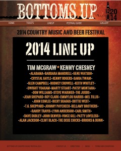
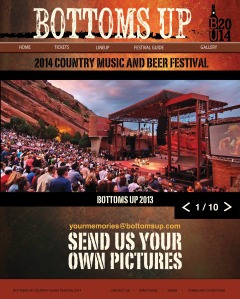
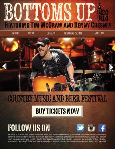
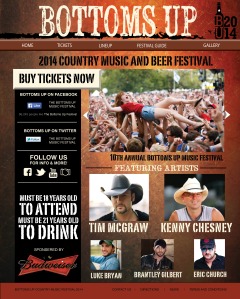
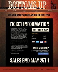
I have continued working on my web portion of the Music Festival designs. For this project, it is necessary that we have 4 different webpages (including a homepage.) I chose to do a Lineup page, a ticket information page, and a photo gallery. These were created in Indesign and will eventually be brought into photoshop in order to eventual create an html document, making the webpage interactive. I will begin coding these designs after I am completely content with the layout.

The most difficult part of creating the print elements is making them all tie in to each other, to keep the consistency. However, with the website it was a little easier because the header and footer are repeated throughout each element.
WEBPAGE

WEBPAGE2

WEBPAGE3

WEBPAGE4

Bottoms Up ! Rough Drafts_Posters

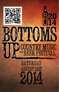
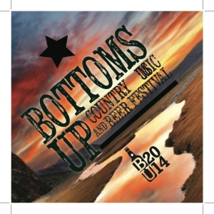
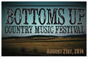
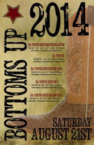
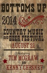
This week we had to create multiple components for a musical festival. I chose to do a country music festival called Bottoms Up, named after a famous country song. We had to create multiple sketches and rough drafts for posters, badges, brochures, and a promotional piece. The hardest part was coming up with a logo. After creating a mind map and researching some country-themed events on google, I came up with some rough drafts for my Country Music and Beer Festival. Here are two posters I have created, they are very rough layouts.

DigitalComp_poster1

digitalcomps_poster2

Using paragraph styles

The hardest part to creating the 16 page booklet is setting up paragraph styles properly. When I had began creating my book, I used many different character styles in order to keep a unified design and make it easier for me to change the colors and sizes of specific text.

After reviewing my book with the professor, I was told paragraph styles are easier to use when using larger bodies of text– you don’t have to highlight things, you just have to put your cursor in the paragraph and choose your paragraph style.

However I am having difficulty linking all my different text to a different paragraph style. I will be working on this and watching tutorials to try and correct the problems. Because there are so many different font sizes and colors being used throughout my document, it will be simpler for me to use paragraph styles once I am able to figure it out.

Creating Animations with Indesign

This week we had to create a 16 page booklet for a company called Down to Earth. For this project we had to create a print version as well as an interactive version. Before this project, I never knew that you could create animations in Indesign.

Before getting started, I watched a tutorial on Lynda.com. Throughout this video, the narrator goes through each step demonstrating how to create buttons, animations, hyperlinks and transitions. I have used movie-making programs in the past so I was kind of familiar with these different characteristics of interactivity.

The hardest part of creating this 16 page booklet was creating visual interest while still using paragraphs and large amounts of text. I used character styles and grids to align the pages. Character styles are extremely helpful and help to create a cleaner, more organized document.

Overall, my Down to Earth book about recycling came out visually interesting and very informative in both the print and interactive versions. Though it is still a work-in-progress, the results are looking good and the finals will be posted in the future!

Song Lyrics Poster

Poster Vintage

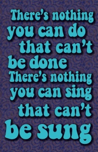
This is my song lyrics poster. It is a song lyric from “All you Need is Love” by The Beatles. It was done in illustrator and uses a font that gives it a 60’s feel. The pattern in the background creates a psychedelic texture and the bright blue text on the darker background helps it to pop. The text has a drop shadow and a outer glow applied to it to help it pop as well.

Creating Minimalist Posters with Illustrator

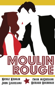
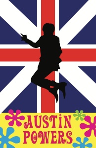
When told to create a movie poster, the amount of different ideas I had were overwhelming. I wasn’t sure which movies to pick or which program to use. After researching different minimalist movie posters online, it was easy to grasp the concept and I couldn’t wait to get started. The program I decided to use was Illustrator because I thought the pen tool would be the easiest way to create simple yet accurate shapes. I did the poster for Moulin Rouge first. I saved the image from Google and brought it into illustrator. From there, I traced over desired sections with the pen tool and chose solid colors to keep the minimalist feel. This was the best way to keep the realistic outlines of the character’s hair and clothing. After rearranging the shapes, playing with different colors and positioning type, I was happy with the outcome. I then moved onto the Austin Powers movie poster and followed the same process. My results were two minimalistic movie posters that captured the theme of the movies.

Coding/SneakerShack html

SNEAKERAD_HTML

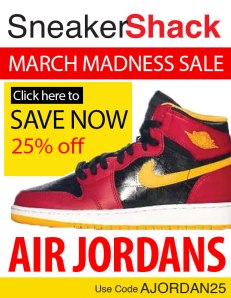
This is another piece of the promotional ads for the March Madness sale for Sneaker Shack. This design is the layout for what will be a working webpage. Like the yoga newsletter, coding will be added to this using Dreamweaver and it will function properly.

This piece follows the same color scheme as previous ads. It was created in photoshop and is promoting the “25% off” sale for Sneakershack.

Coding is an intimidating and overwhelming process but is relieving when you finally get the results you are looking for. It is definitely necessary in becoming a designer and will come in handy when I am fully able to utilize it.